Prototyping
UX worked on figmas for the team to use for prototyping the application. We created wireframes and mockups of the user interface to get a better idea of how the application would look and feel.
Problem Statement: Xorbix is a company that specializes in providing software solutions for companies in many industries. They are the premier provider of Databricks solutions in Wisconsin. The problem statement for the hackathon was to create a software solution that improves Quality Assurance Descision making and Defect detection.
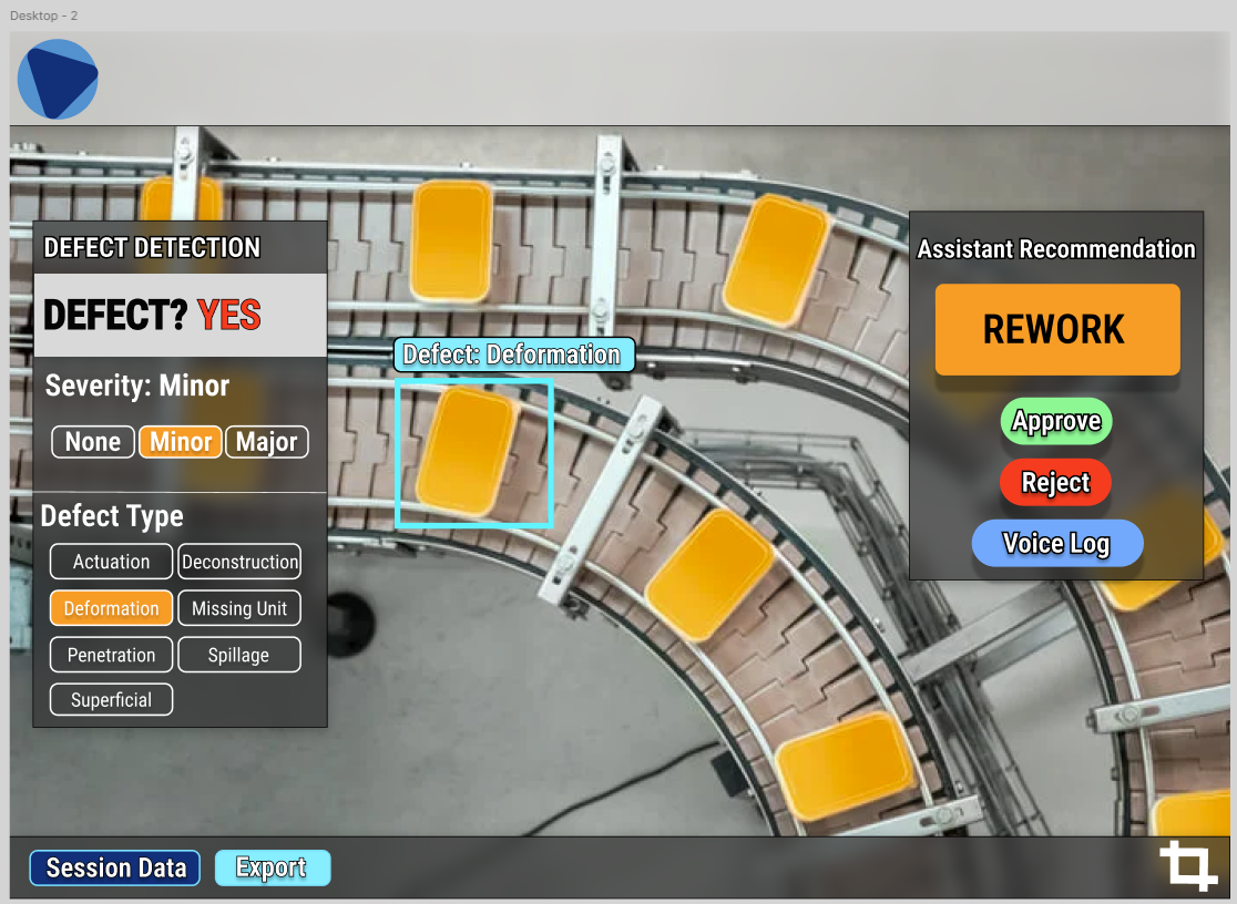
Solution: My team created a camera first desktop, mobile, and Mixed Reality application which focused on removeing distractions from the operator while performing quality assurance inspections. The application uses computer vision to identify defects in products and provides real-time feedback to the operator as well as informing the operator what the correct course of acion is when a defect is detected. We used an AI pipeline involving Yolo v11 to crop products out of the overall image, then we passed those product images to a custom Vision Transformer trained on the Kapput Dataset. When a defect was detected, we passed the VIT output to a custom GPT 5 mini agent to make the final decision on how to proceed. The application was built using Next.js and TailwindCSS for the desktop and mobile app while the MR app was built on Mixed Reality Toolkit 3 and Meta Spatial SDK.
Skills Used:
UX worked on figmas for the team to use for prototyping the application. We created wireframes and mockups of the user interface to get a better idea of how the application would look and feel.
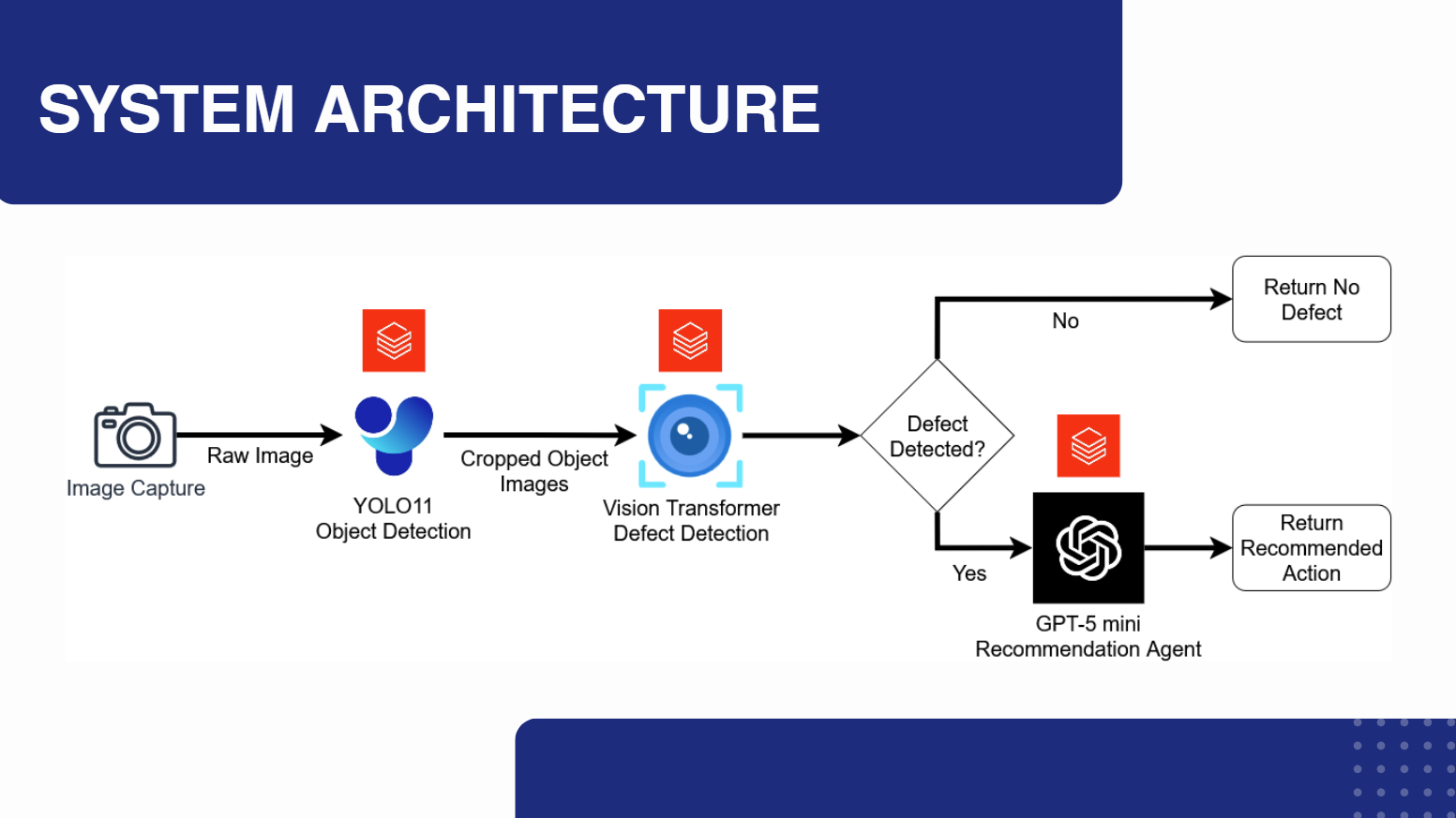
The AI pipeline was a crucial part of the application. We used YOLO v11 to crop products out of the overall image, then we passed those product images to a custom Vision Transformer trained on the Kapput Dataset. When a defect was detected, we passed the VIT output to a custom GPT 5 mini agent to make the final decision on how to proceed.
The desktop application was built using Next.js and TailwindCSS. The application was designed to be user-friendly and easy to navigate. The desktop app was the primary interface for the application.
I started the development process by using MRTK3 and a Meta Quest 3 with camera passthrough to create a prototype of the Mixed Reality application. Images were passed to the vision transformer and the results were displayed on a canvas which follows the user's body.
I was able to get Yolo running on the device and used it to crop products out of the overall image.
I began the final development of the Mixed Reality application by working closely with out UX members. I implemented the Vision Transformer and GPT 5 mini agent API pipeline into the application and created a user interface that was easy to navigate.
The final step was to present the application. We created a presentation that included a demo of the application and a summary of the development process. We presented the application at the Xorbix Innovation Lab Hackathon final event where we got 3rd place in the competition for our solution and attention to the business problem.