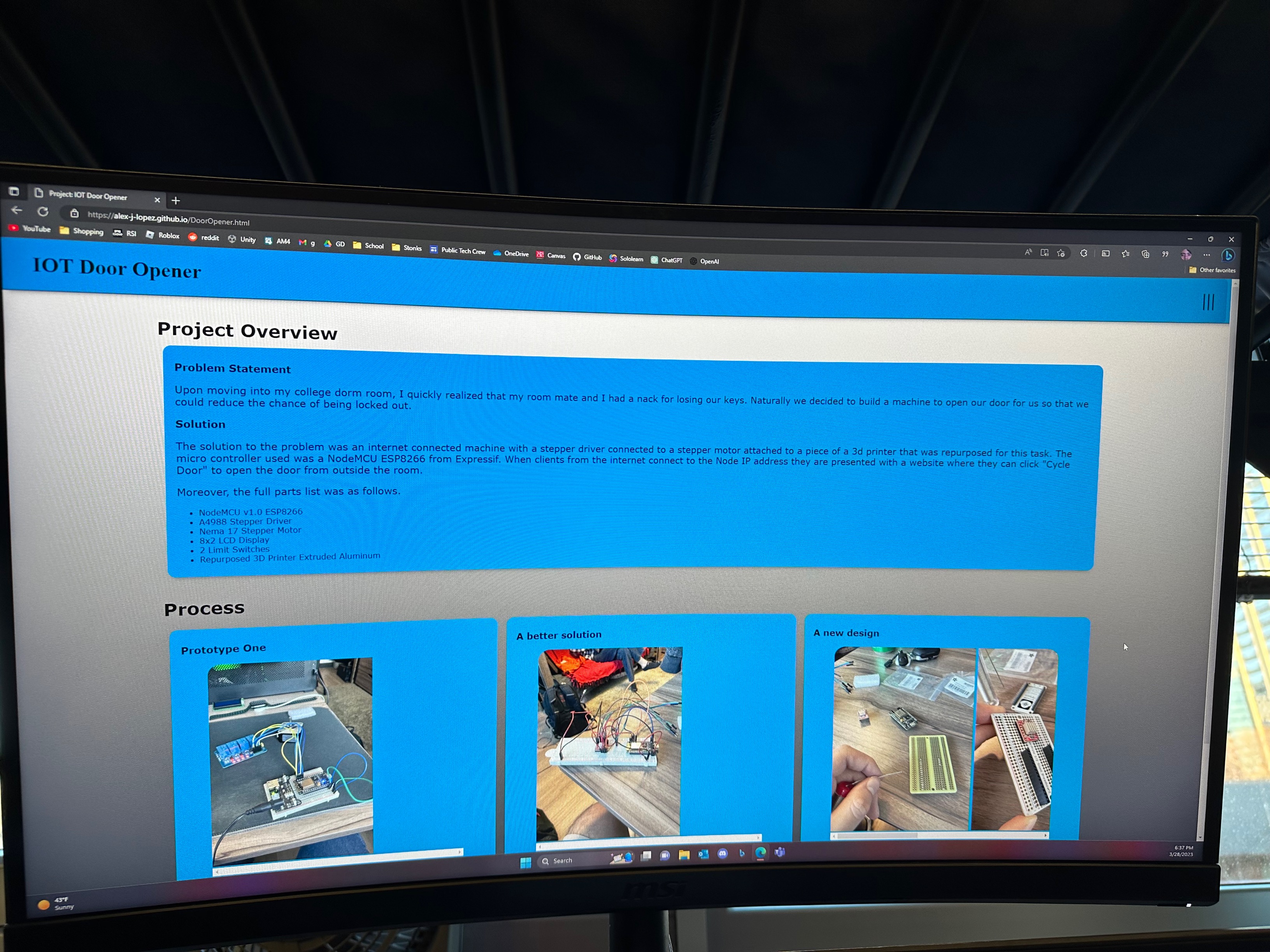
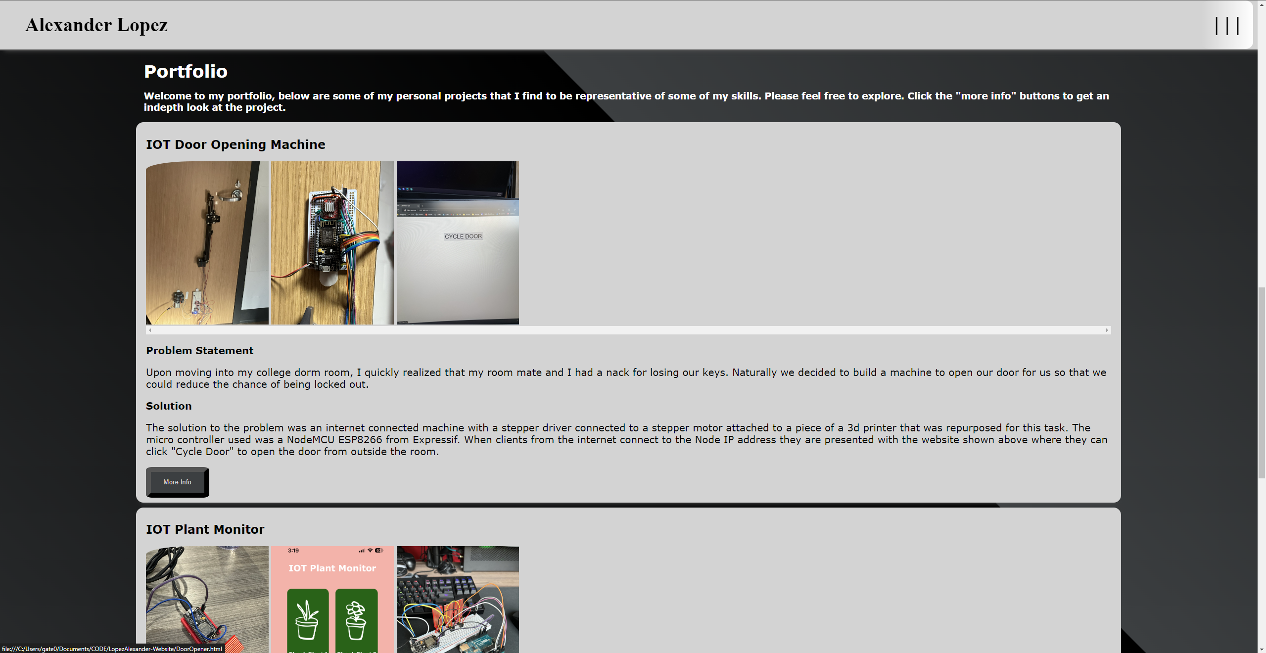
Alexander Lopez

Personal Portfolio Website

Project Overview

Problem Statement

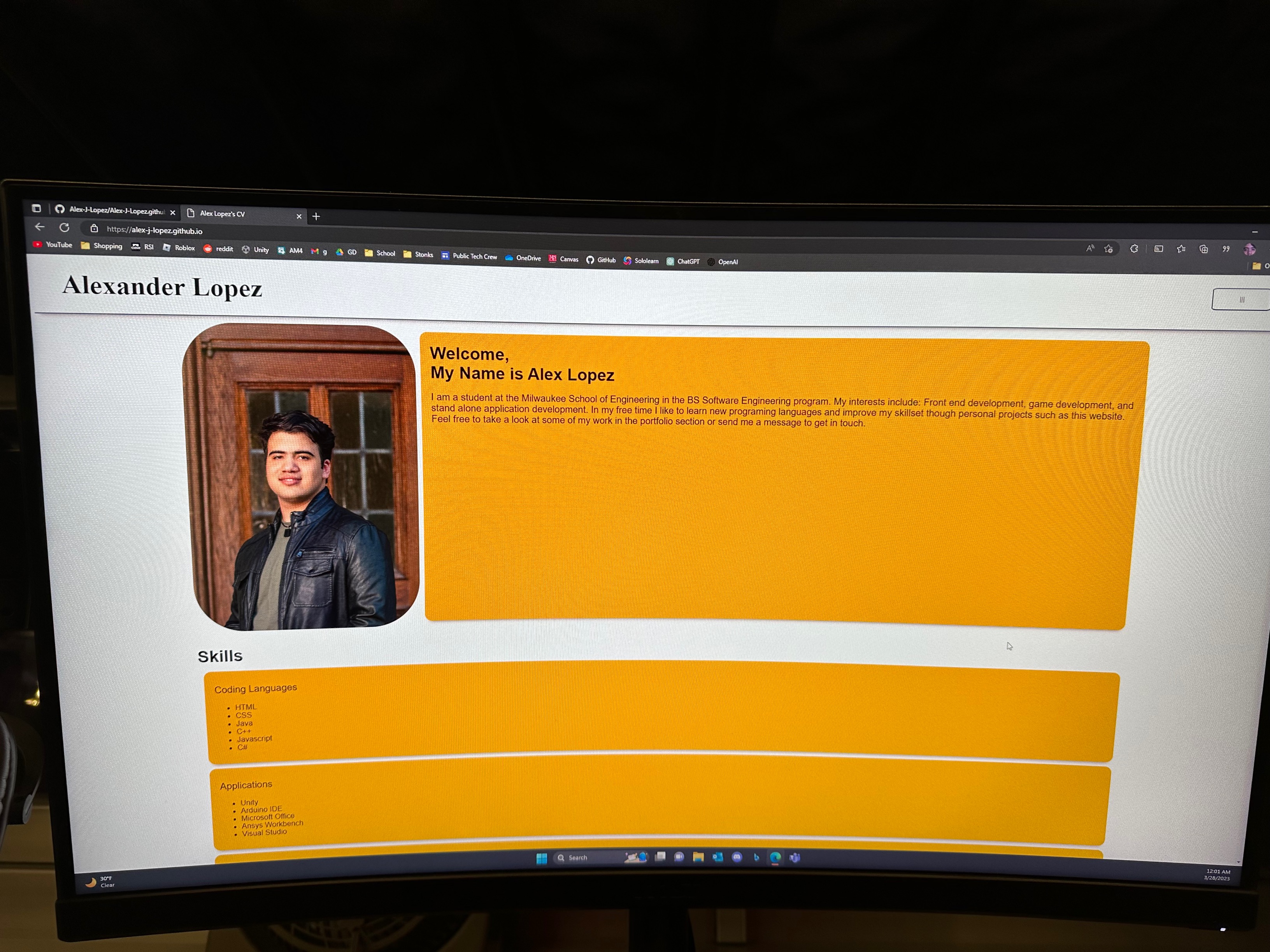
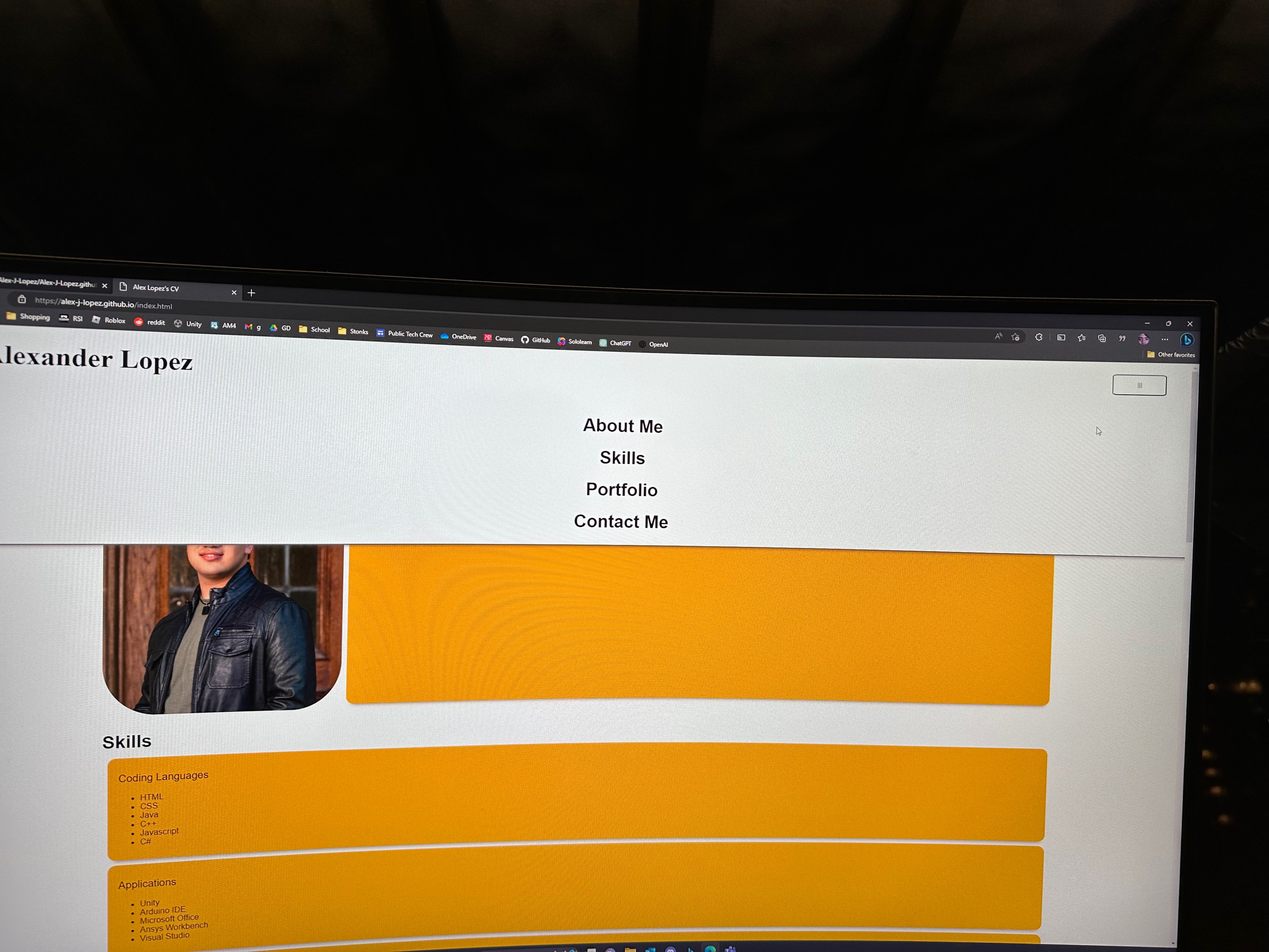
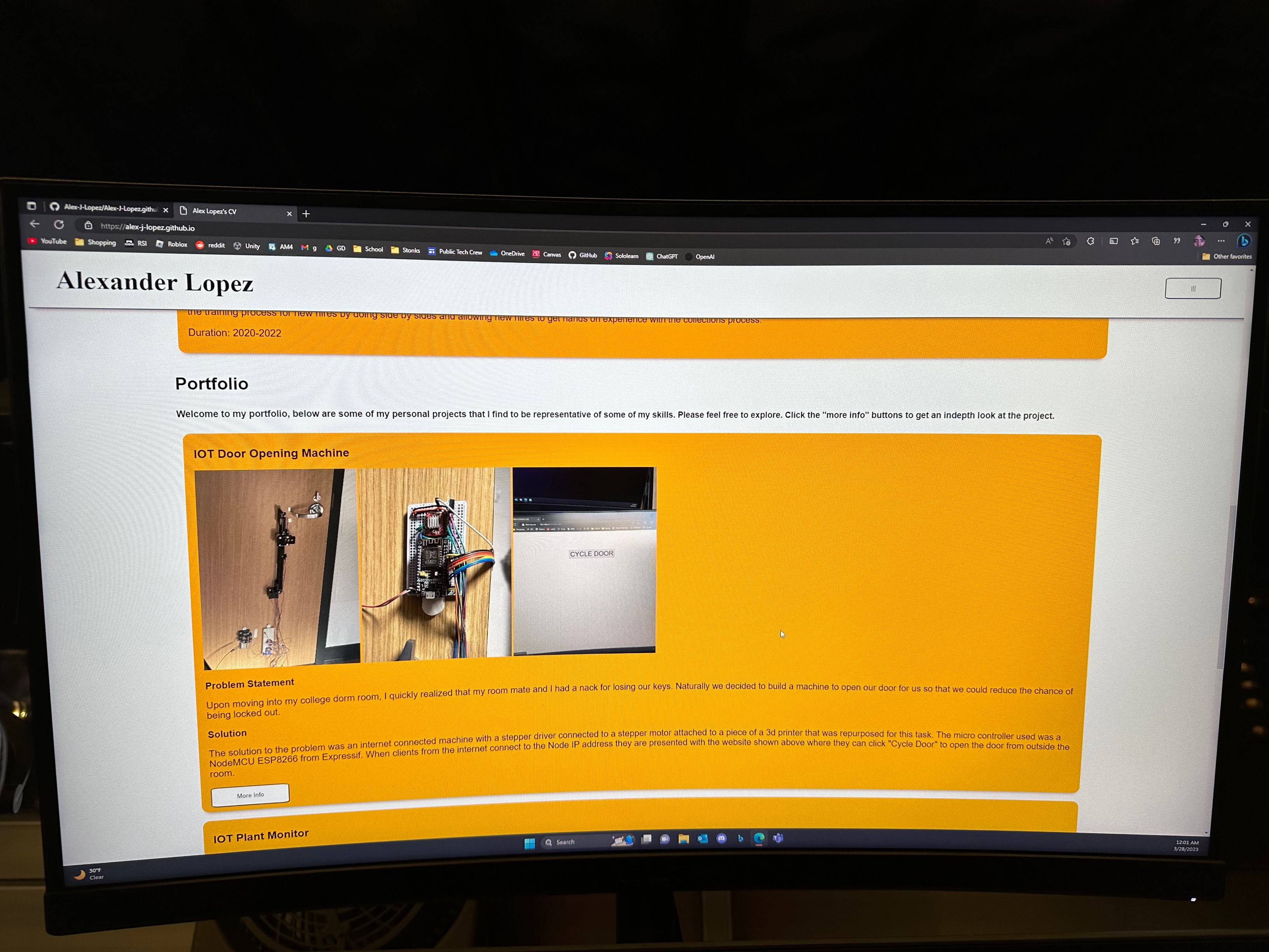
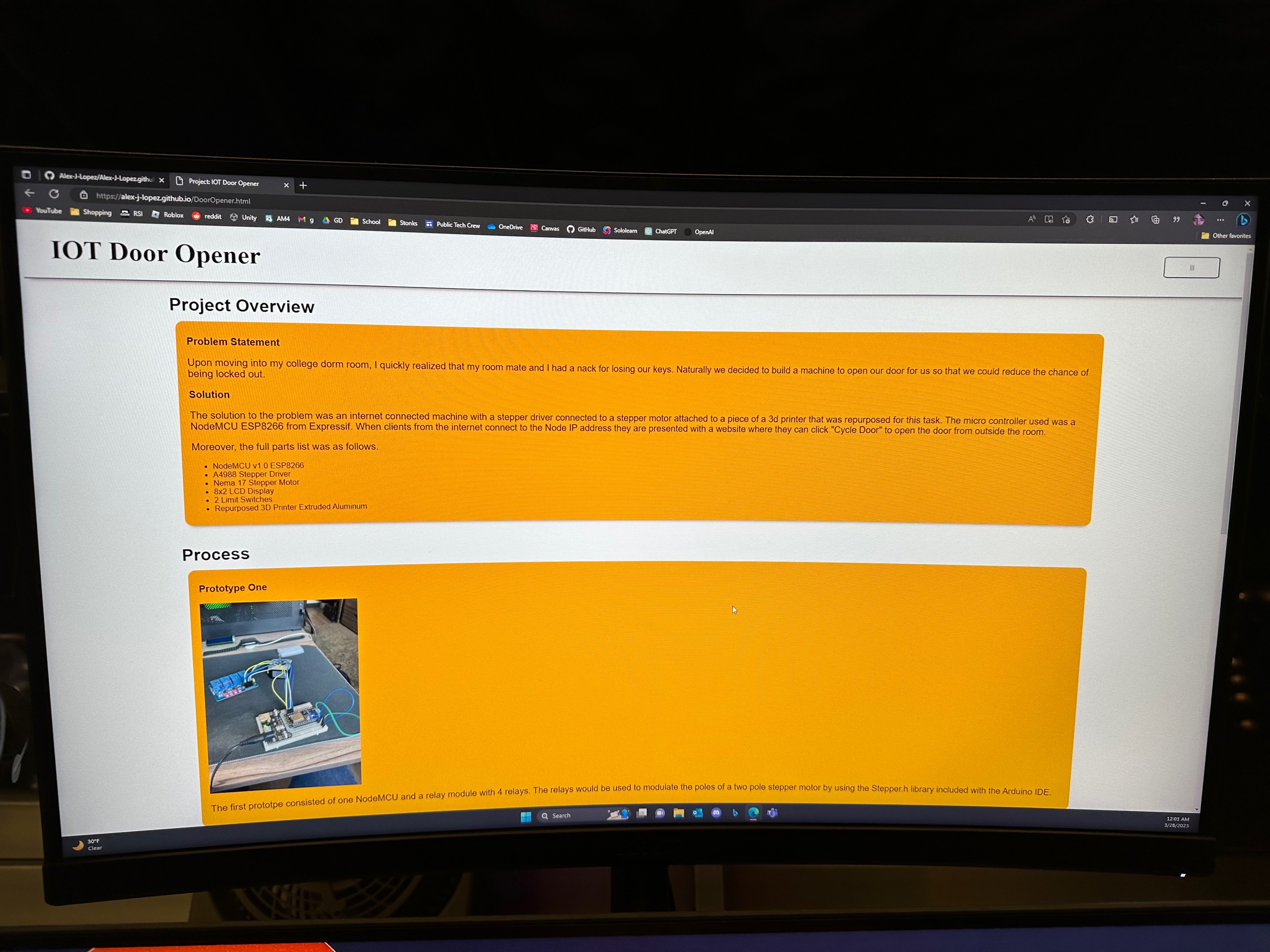
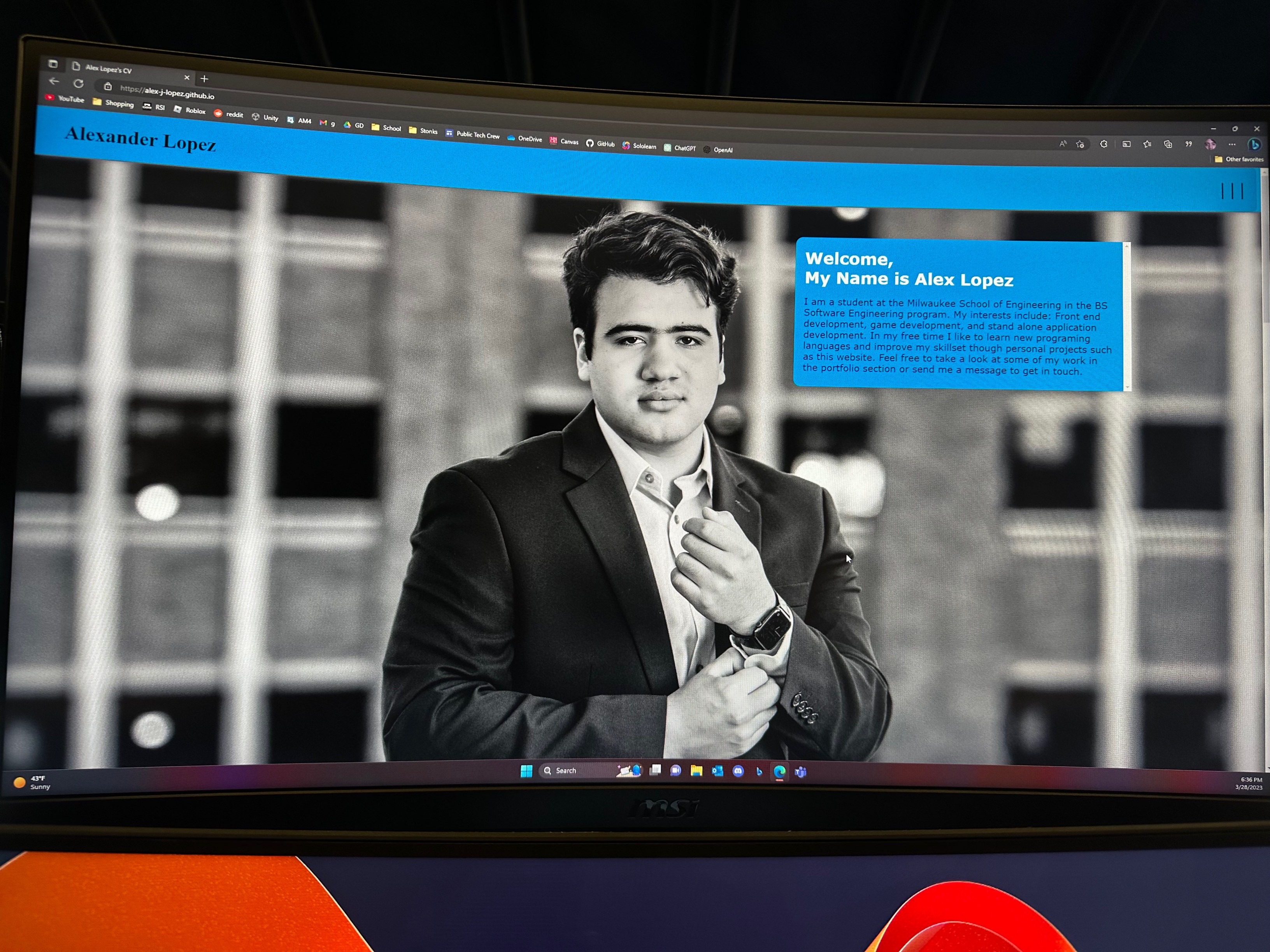
Having just started my freshman year at university in the fall of 2022, I had far reaching ambitions for myself. I quickly began doing personal projects in order to improve my skills. I needed a place where I could keep a record of each of my projects and my creative process.

Solution

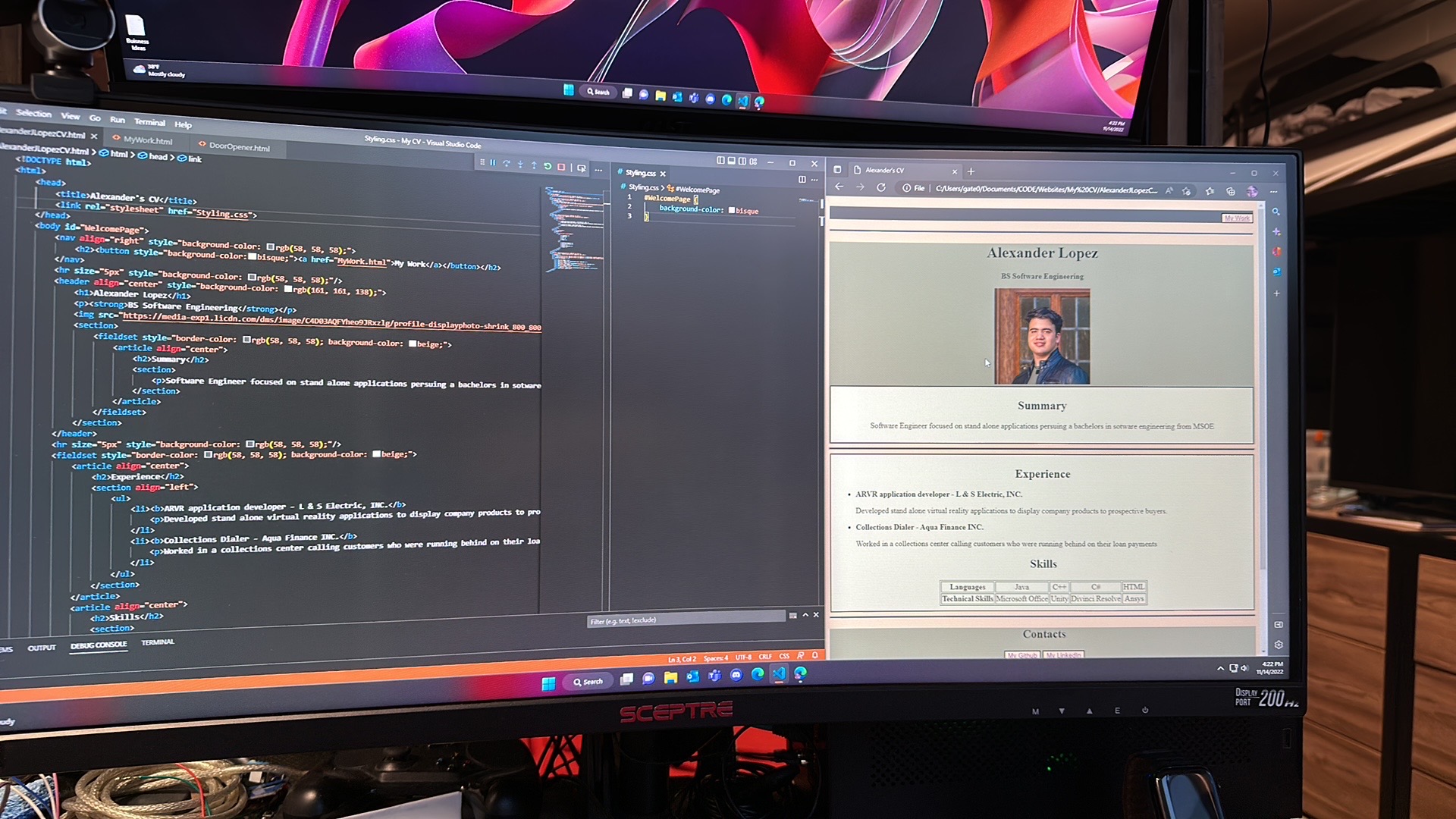
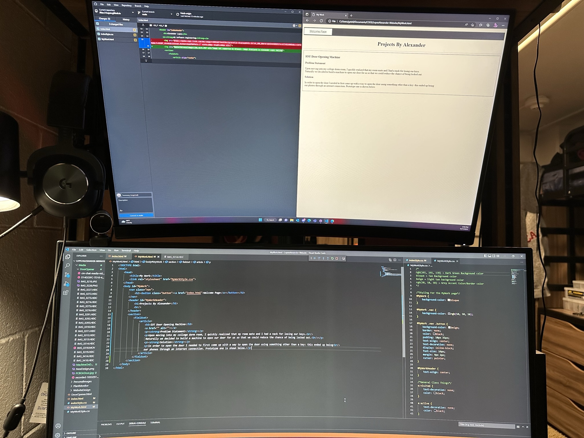
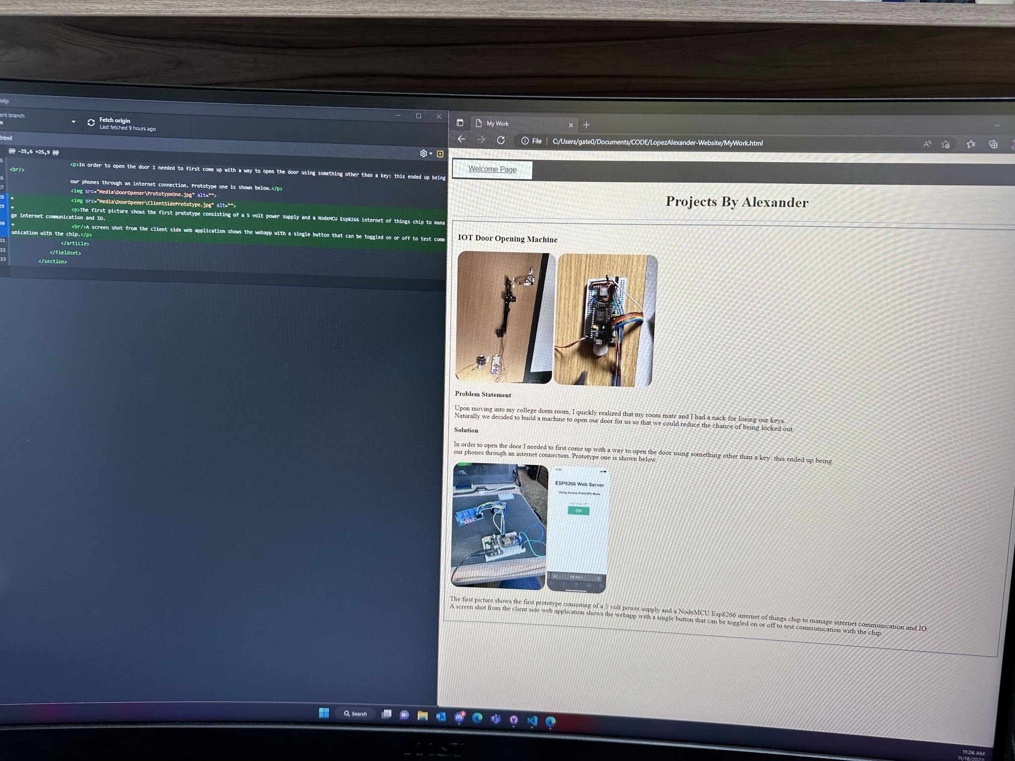
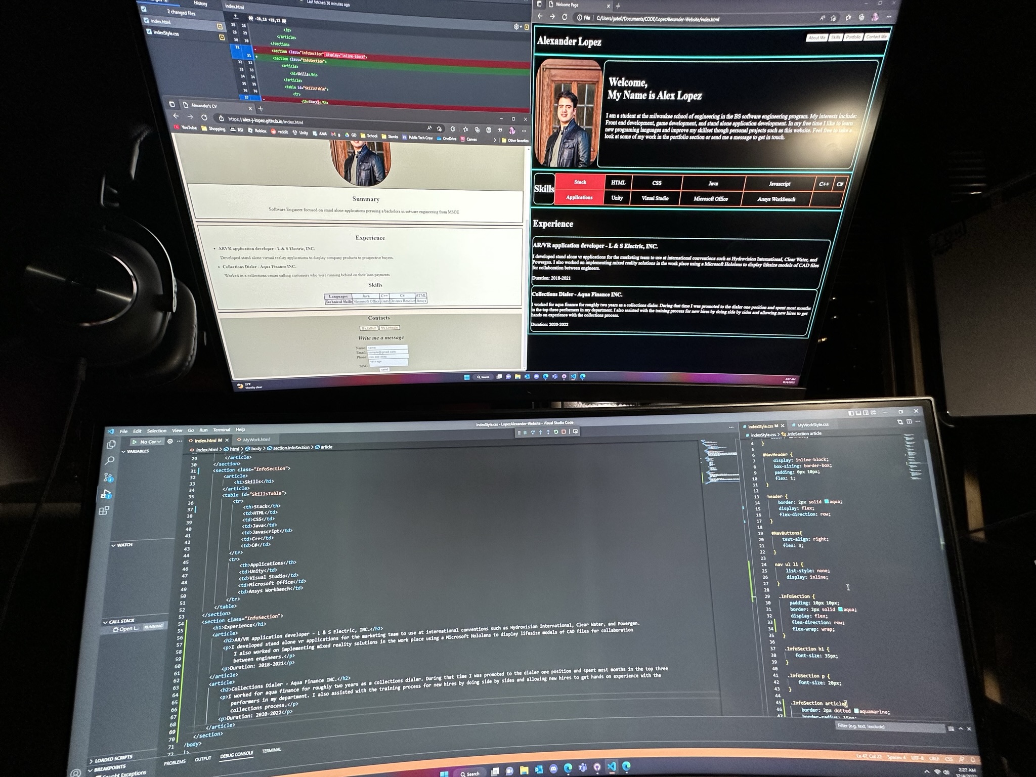
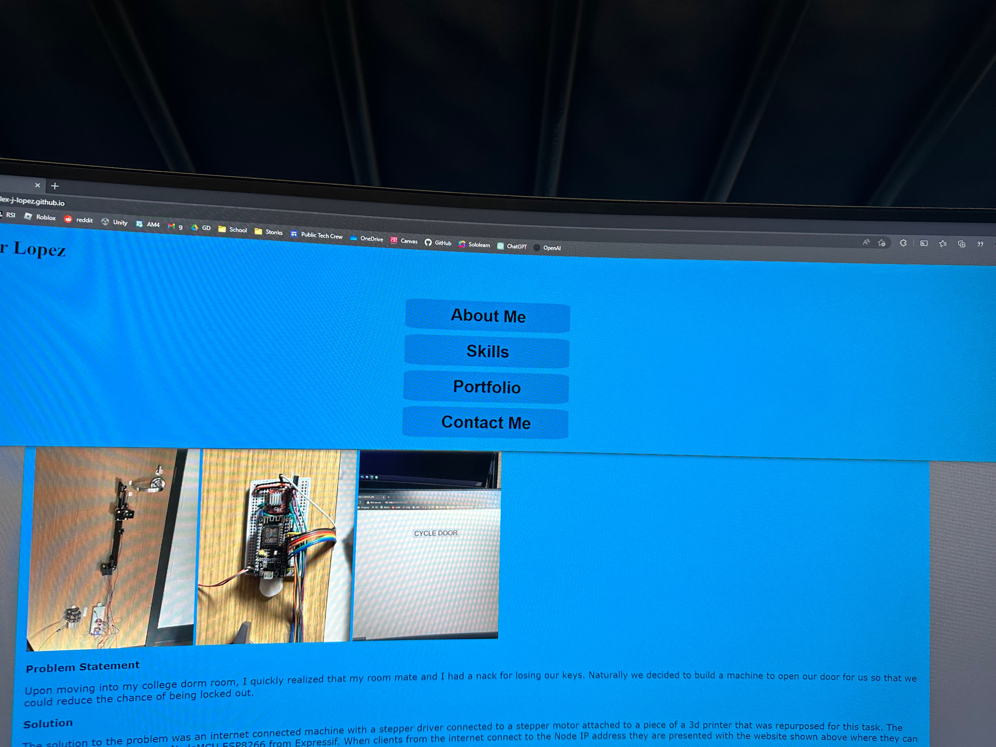
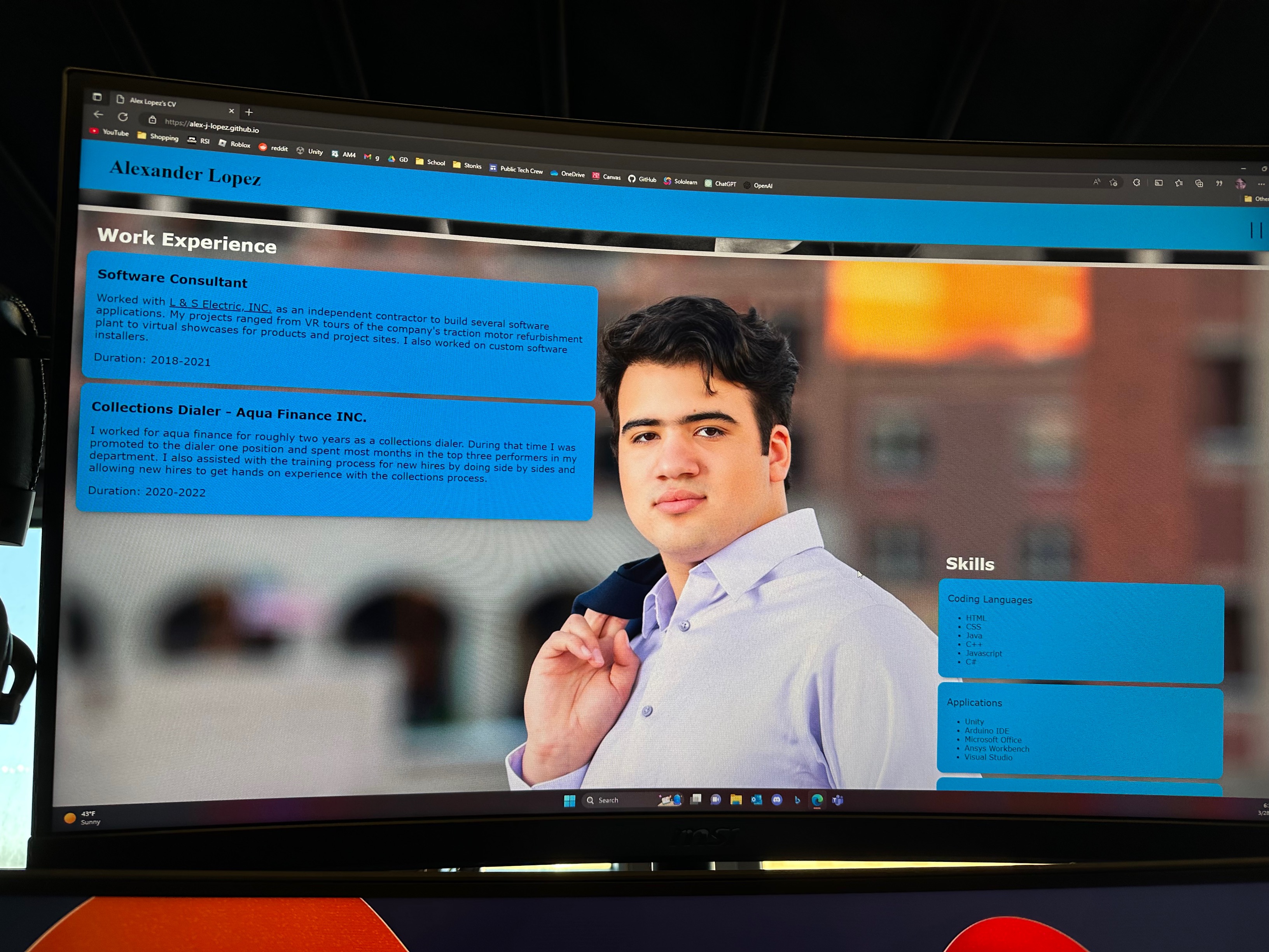
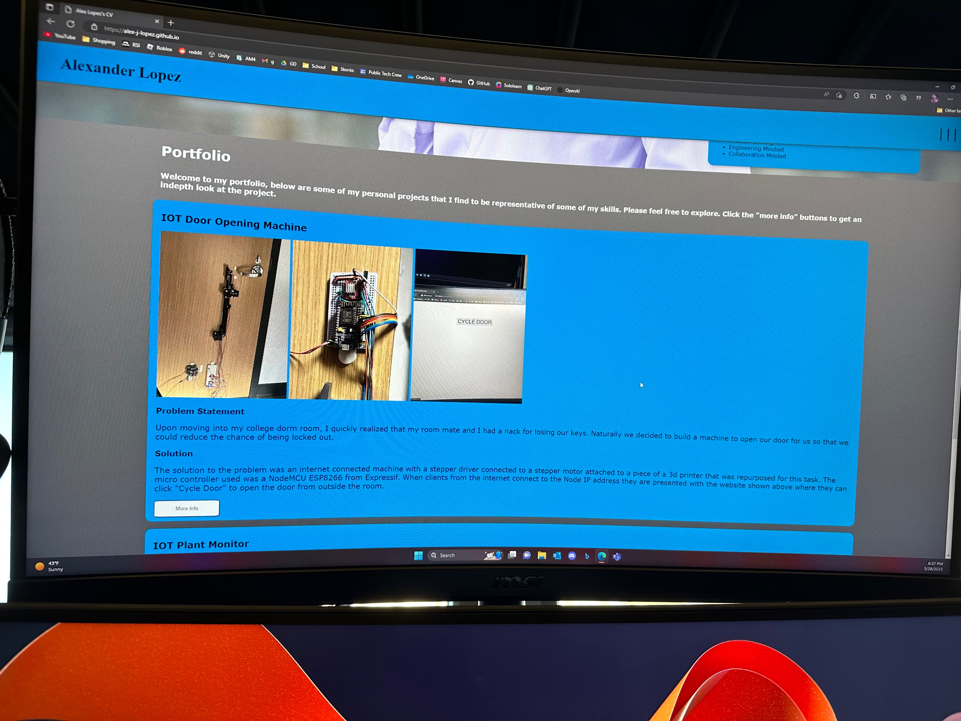
There were a few solutions to my problem. I could purchase a subscription to a website making application and create my website that way. I could give prospective employeers a link to a google drive with all my projects. Or, I could improve my web development skills and create my own website. As you can tell by now, the thrid choice was both the most professional and also the choice I decided upon. I learned HTML, CSS, and some javascript in order to make this idea happen.

Skills Used for This Project:

Code can be found at my github.

Development Process

Version 1

Image not supported Image not supported Image not supported

The first version of my website was extremely basic. I realized there were a lot of components that went into making a professional looking website and that I would need to be organized. As you can see in the images, my first website look a bit like something from 2004.

Intermediate Version 1-2

Image not supported

Due to the dated look of Version 1, I decided to abandon it. Imaged is the prototyping of the new design. I wanted to make the information flow and make sense while looking modern and sleek. I started by making a standard hierarchy of sections followed by articles. This would allow me to contain and position articles of text while allowing me to position several related articles at once via the section parent.

Version 2

Image not supported Image not supported Image not supported Image not supported

Pictured above is the second version of my website. I went with an orange and white style because it was not distracting. I felt that this version of the site was when it began to look somewhat modern. The main issue with this version of the website was that it lacked space efficiency, was not particularly responsive to different resolutions, and had rampant code repetition which made it nearly impossible to change the styling quickly.

Version 3

Image not supported Image not supported Image not supported Image not supported Image not supported

For version three I wanted to make a strong move towards a modern look. With code repetition rampant, the first course of action was to completely rework the CSS files. I created a unified globalAttributes.css file where I could manage the color scheme of all objects as well as mandate site wide visual consistency. This helped with branding and overall improved the development process. Next, I focused on making an impact. Using images as a background and choosing a color that was striking were my main focus. Problems with this version were not so obvious: the color scheme was not ideal, the mobile site's background was intrusive to the readability, and resolution responsive design was not yet complete.

Version 4

Image not supported Image not supported Image not supported Image not supported Image not supported

This is the current version and state of the website. The color scheme was changed to grey and graphite colors which match the creative vision that I had for this site. All parts of the website respond appropriately to the resolution changes I was capable of testing, the project Pages were substantially improved, and the overall user experience was improved.

Contact Me